This article is a sponsored by Penpot
Among design tools, Penpot holds a special place. It is an open-source design tool, meant for designers and developers to work together and help them speak the same language. It’s also the first design tool out there to be fully open-source and based on open web standards.
That’s a perfect choice for designers and developers working closely together as Penpot’s approach can help to radically improve design to development processes and effortlessly make them seamless and faster.
As open-source software, Penpot also evolves blazingly fast, fueled by the support of the community. When I was first writing about Penpot a few months ago, I shared my excitement about the app’s layout features that finally bring parity between design and code and follow the same rules as CSS does. Since then, the team behind Penpot has made creating layouts even better, so they deserve another look. I really enjoyed playing with the new Penpot’s features, and I believe you might want to give them a try too.
Designing Layouts Done Right
If you ever wrote or read CSS code, there are high chances you have already stumbled upon Flexbox. It’s a cornerstone of building layouts for the modern web, and quite likely, every single website you visit on an everyday basis uses it.
Flexbox is the bread and butter of creating simple, flexible layouts. It’s the most common way of positioning elements: stacking them in rows and columns and deciding how they are supposed to be aligned and distributed.
Therefore, creating Flexbox layouts is a vital part of most web hand-off processes. And not rarely time-consuming and causing friction between design and development. Usually, developers try to translate static mockups into code by rebuilding layouts made by designers from scratch. As most designers don’t write CSS code and most design tools follow a different logic than CSS does, lots can go wrong or get lost in translation.
This is where Penpot’s Flex Layout comes into play. Layouts built-in Penpot don’t need tedious translating into code. Even though designers can build them using a familiar visual interface, they come as production-ready code out-of-the-box. And even if they need tweaking, they can still save developers plenty of time and guesswork as they follow a logic that is already familiar and understandable to them.
So at the bottom line, it benefits everyone. It’s less work for developers as they get the code they need straight away. It’s better for designers as they have finer control over the final effect and a better understanding of the technologies they are designing for. And finally, it’s good for business as it saves everyone’s time.
All of that without making the designer’s job an inch harder or forcing them to write a single line of code. Now, let’s take a look at what building designs with Flex Layout look like in practice!
Getting Started With Flex Layout
As mentioned before, Flexbox can be understood as a toolkit for building layout and positioning elements.
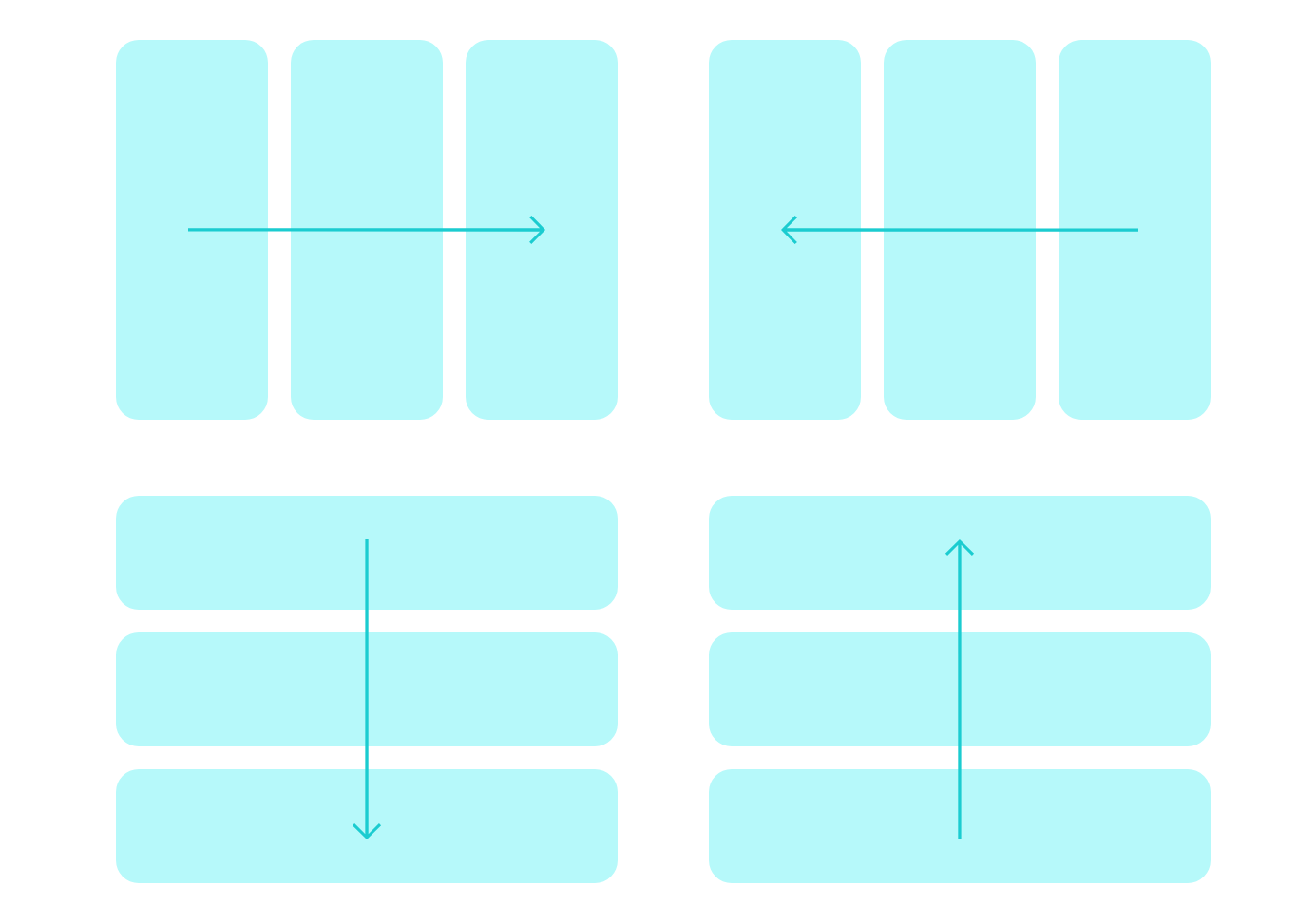
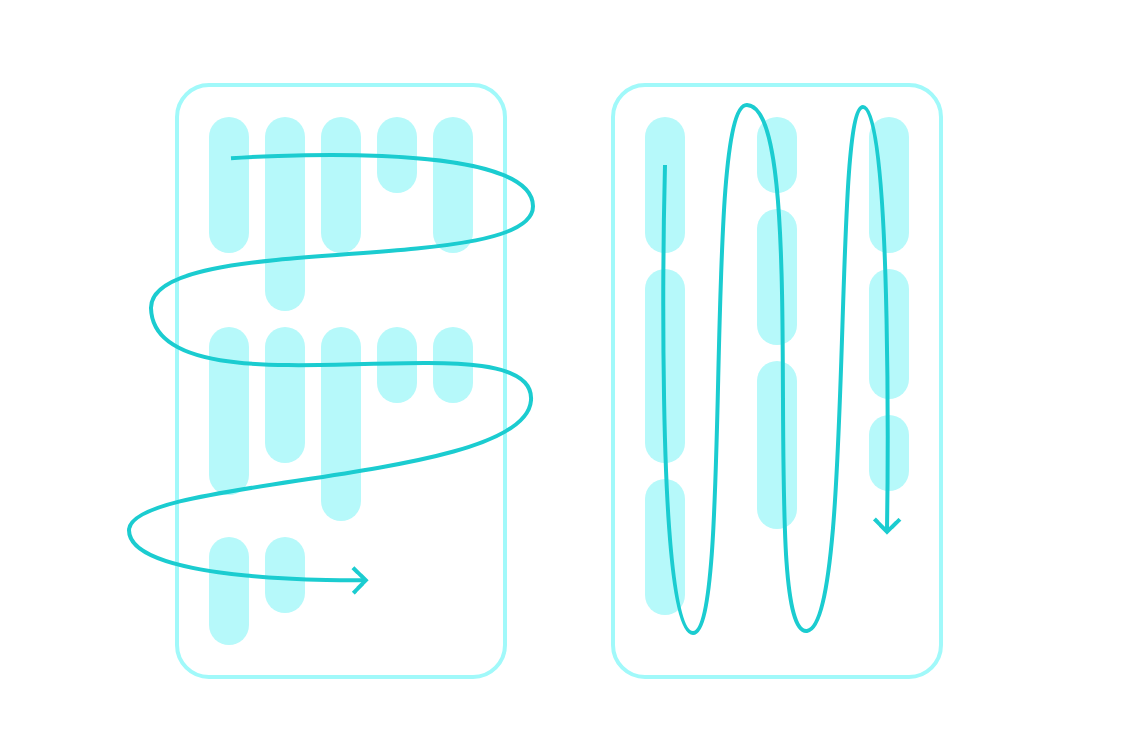
Each Flex Layout is generally an array, a list of elements. This list can be sorted from left to write, right to left, top to bottom, or bottom to top.

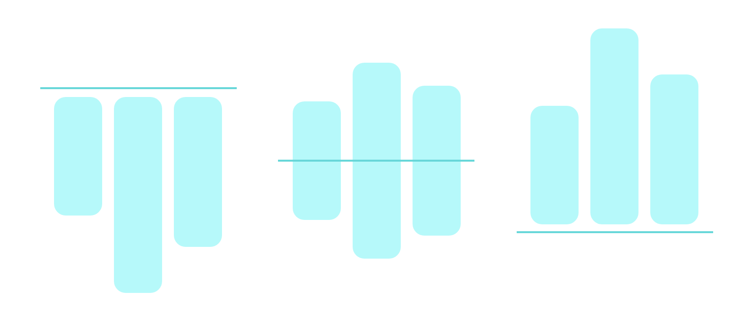
Flex Layout allows you to control how elements in these lists are aligned against each other.
You can also control how elements are laid out within containers.
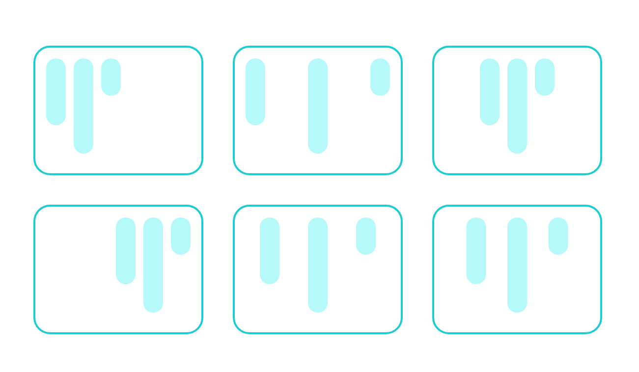
Flex layouts can wrap into multiple lines too. You can also nest them indefinitely to create as complex layouts as you wish.
And that’s just the beginning. There are many more options to explore. As you can see, Flex layout gives you much more possibilities and precision than most design tools do. Creating with it is not only a better process but a more powerful one.
To explore all the possible features of Flex Layout, Penpot’s team created a comprehensive Playground template for you to try. If you don’t have a Penpot account yet, go ahead and create one now. Then, duplicate the file and try to play with it yourself! The file will take you on a journey through each and every Flex layout feature, with clear examples and definitions, so you can start building complex, robust layouts in no time.
Building An Example Together
To give you an even better understanding of what working with Flex Layout is in practice, let’s look at a practical example. In the next few steps, we will dig into the structure of this little mockup and rebuild each and every part of it with Flex Layout.
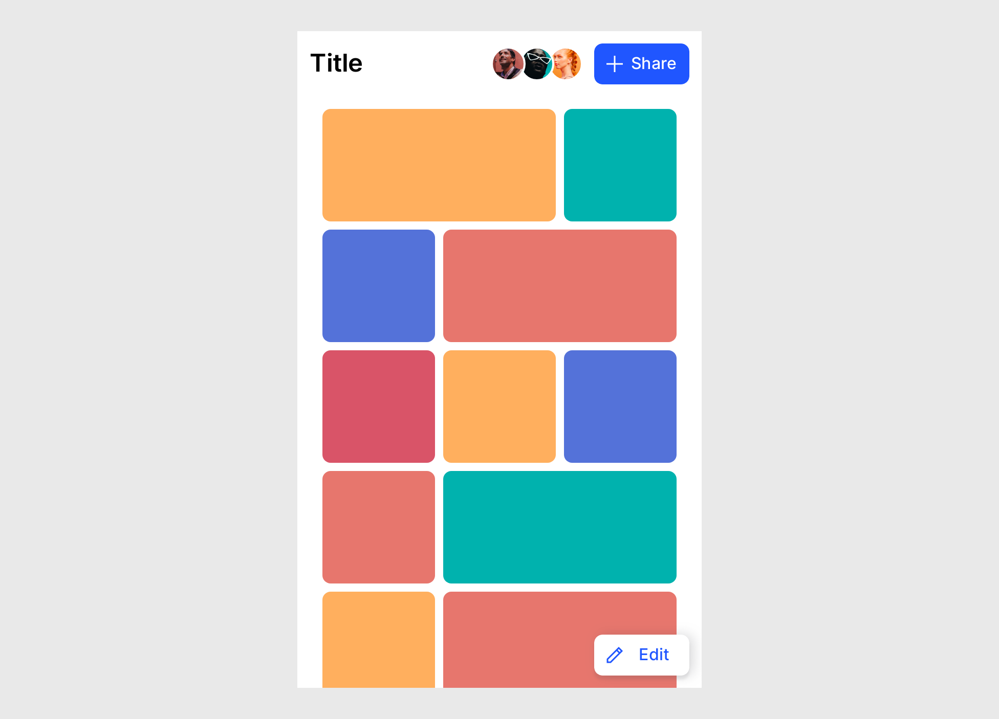
For the first elements, we can use Flex Layout for our buttons. With a few clicks, we can make sure they are responsive to the size of the icon and the label inside, and set paddings and distances between the children elements.
We can also use Flex Layout for the avatars stack. To make the images overlap, a negative gap between the elements does the trick. We also have full control over the order of elements. We can lay out the stack in any direction. We can also control the stack order of each element individually. That’s thanks to Penpot’s support for z-index, another useful CSS property.
Flex layouts can be nested, creating more complex layouts and dependencies. In this case, we’ll create a separate Flex Layout for the navbar and another for the tiles grid below.
Remember that elements in Flex layouts can be wrapped? Let’s see this in action. In this case, we can create a flexible multi-dimensional layout of elements that’s responsive to the parent container and fill it with blocks both vertically and horizontally, just as CSS would do.
But what if some of the elements don’t belong to the grid? Alongside Flexbox, Penpot provides support for absolute positioning. This means that any element can be picked up from the Flex Layout to still leave in the same container but ignore the layout rules. That’s exactly what we need for the ‘Edit’ button.
Eventually, we can transform the whole board into a Flex Layout. Now, we have a design that is not only easy to work with and edit but is also fully flexible. Wondering how your design would perform on a smaller or bigger screen? All you have to do is to resize the board.
Next Steps
If you’d like to take a look at the source file of the layout we’ve just built, go ahead and duplicate this file.
To dig deeper and learn more about how to use Flex Layout, don’t forget to try the Flex Layout template.
In case you get stuck or have some questions, Penpot Community would be the best place to look for help.
There is also a great video tutorial that explains how designers and developers can work together using Flex Layout.
Summary
As you can see, with Flex Layout, the possibilities for structuring your designs are endless. I believe that features like this are a welcome change in the design tools scene and a shift in the right direction. Helping designers to take more control over their work and helping developers to work as efficiently as possible.
Coming Soon: Support For CSS Grid
Maybe you’re now thinking the same as I am: CSS layouts are not only Flexbox, are they? If you work with CSS, you probably know that Flexbox alone is not enough. More complex layouts are often better built using CSS Grid. Flexbox and Grid work best when combined together — combined to create precise yet complex and fully responsive websites.
Penpot doesn’t support CSS Grid just yet, but that is about to change! You can learn more about it at the upcoming Penpot Fest. During the event, Penpot’s team will share their plan and a demo of the upcoming Grid Layout feature. Don’t hesitate to join (virtually or in person), if you’d like to learn more about the next steps for Penpot.