Wikipedia is more than a website — it’s perhaps a cornerstone of the World Wide Web. For decades, the site has provided a model for collaborating online, designing long-form content layouts, and supporting internationalization.
One of the more endearing qualities of Wikipedia is its design, which is known for its utilitarian aesthetics that have stuck around since its 2001 inception. The site has undergone redesigns before, but they are rare and often introduce subtle updates.
This year, 2023, marks the first Wikipedia redesign since 2014. Alex Hollender and Jon Robson led the effort and were kind enough to discuss it with us. The following is an interview that delves into what changed in this latest design, getting into the process as well as design and development details that we all can learn from.
Interview
 Geoff Graham: When I think of Wikipedia as a website, I think about the design first and foremost. It’s classic for its focus on function over aesthetics, yet often considered a relic along the same lines as Craigslist. How was it decided that “now” is the right time for a redesign?
Alex Hollender: You know, it’s funny, I think people sometimes assume that organizations make these super-calculated, methodical decisions, and maybe some do. What I’ve experienced more often are opportunistic decisions resulting from some combination of intuition and relationships. Nirzar Pangakar, the design director back in 2019, knew what the organization was hoping to accomplish in the coming years and understood that media and content on the internet were changing rapidly. He saw that we needed to set ourselves up with a better foundation to iterate on top of going forward. He also imagined how the website looked to newcomers and thought that making it a bit more familiar to them would offer a more inclusive experience. And I think he also sensed that in terms of the culture of the Wikipedia community, if we let any more time pass before making some changes, the conservativism and ossification would grow more and more intense, and projects like this would only become more difficult down the road.
So it’s not like something was severely broken, or data was pointing us towards a specific problem or opportunity. There were a few concrete things we knew could be improved, but the driving force was Nirzar’s intuition regarding some of these larger things. He had a great relationship with the Chief Product Officer, Toby Negrin, and our team’s Product Manager, Olga Vasileva, and found an opportunity to get the project started. And because it can be somewhat difficult to articulate these sorts of intuitions, Nirzar, Olga, and I made a little design sprint to help others envision and understand the types of changes we could start with and where they might lead us.
Geoff: Wikipedia is more than just a website, right? It’s more like 300 sites where each instance is a different language. How do you approach a design system for a large network of sites like that? Is there a single, centralized source of truth, or is it something looser, depending on the locale?
Alex: Right, so there’s Wikipedia in over 300 languages, then there’s also a bunch of sister projects, including WikiData, Commons, WikiQuote, WikiSource, and others — all of which use the same interface. I’d say the needs are maybe 80-ish percent the same across all of the experiences. Then you’ve got things where specific languages need special functionality, or the WikiData search bar needs something extra, or the WikiSource “article” page has different needs from the Wikipedia one.
There’s, unfortunately, no single source of truth — we don’t even have all of the customizations and variations documented. A big part of being a designer here is just building a catalog in your mind over time. Different people know about different little nooks and crannies and would remind us like, “Hey, if you want to put a button there, you’re going to have to figure out something for project X in language Y because they’ve got a custom feature living in that spot currently.” It’s this very organic, emergent kind of thing where it’s just grown to fit people’s needs in a very unstructured, decentralized way. Super cool but quite difficult when you want to tweak some of the more fundamental/foundational parts of the experience.
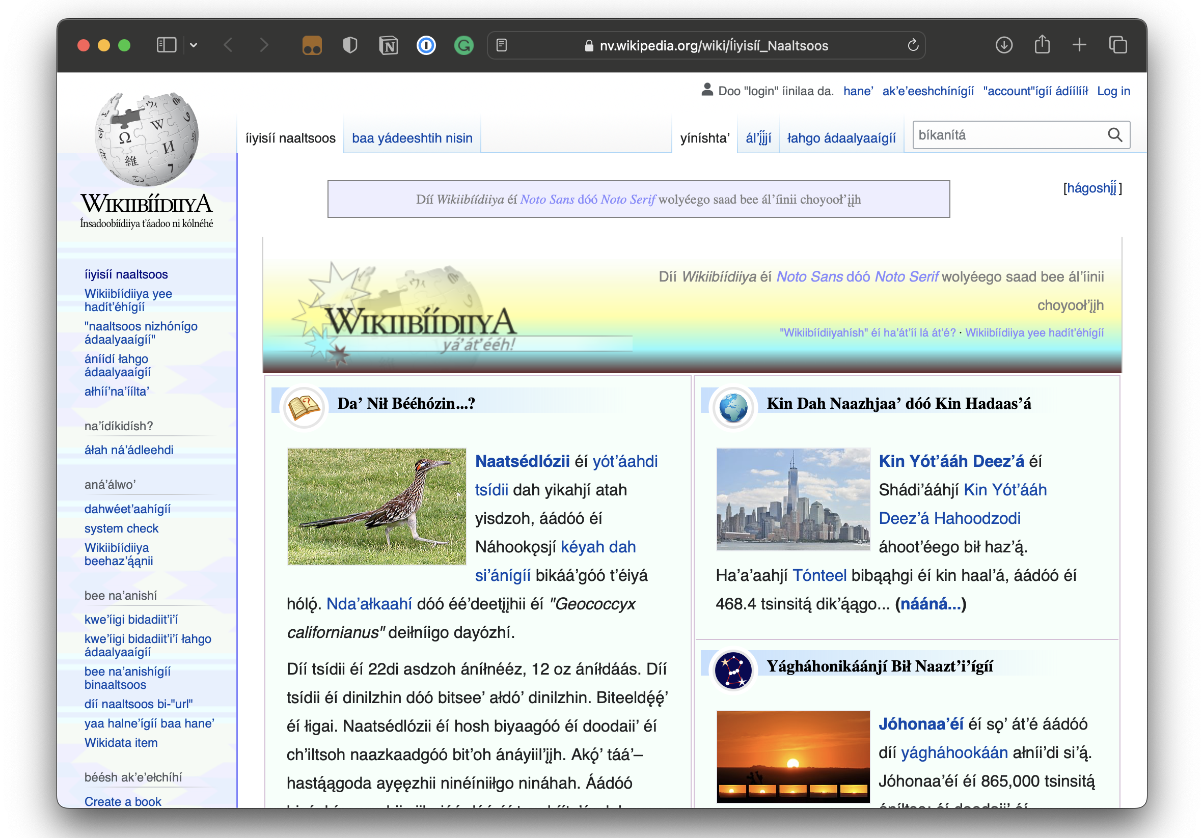
Jon Robson: Before I worked on Wikipedia, I’d never worked on multilingual sites. There’s such a fascinating depth to it, for example, how numbering systems differ in different languages, how quotation marks should be considered translated content, how certain projects have content in two scripts, and how some projects add their own cultural flavor to the design. If you look at the Navajo Wikipedia website, they use a Navajo rug pattern which they’ve had since at least 2005.
It was fascinating how during this redesign, every release risked disrupting something small, as it was impossible to audit everything that was happening in all those projects. We had to make peace with the fact that we might not be able to retain them all and that things would break, and we’d iterate and find a happy medium. Often it’s unclear who to talk to about these things within the organization. Some projects just notice our changes and adapt, while other communities are more vocal. So we have to work together to reconcile these extremes. I’ve been impressed with how Alex has remained so stoic as a designer despite the curve balls the project has thrown at him.
Geoff: I imagine there’s a fine balance when working on a redesign for a site that’s as ubiquitous and that has as a long legacy as Wikipedia. How important was maintaining a sense of familiarity with the design for users? And how constraining was that for introducing new design elements?
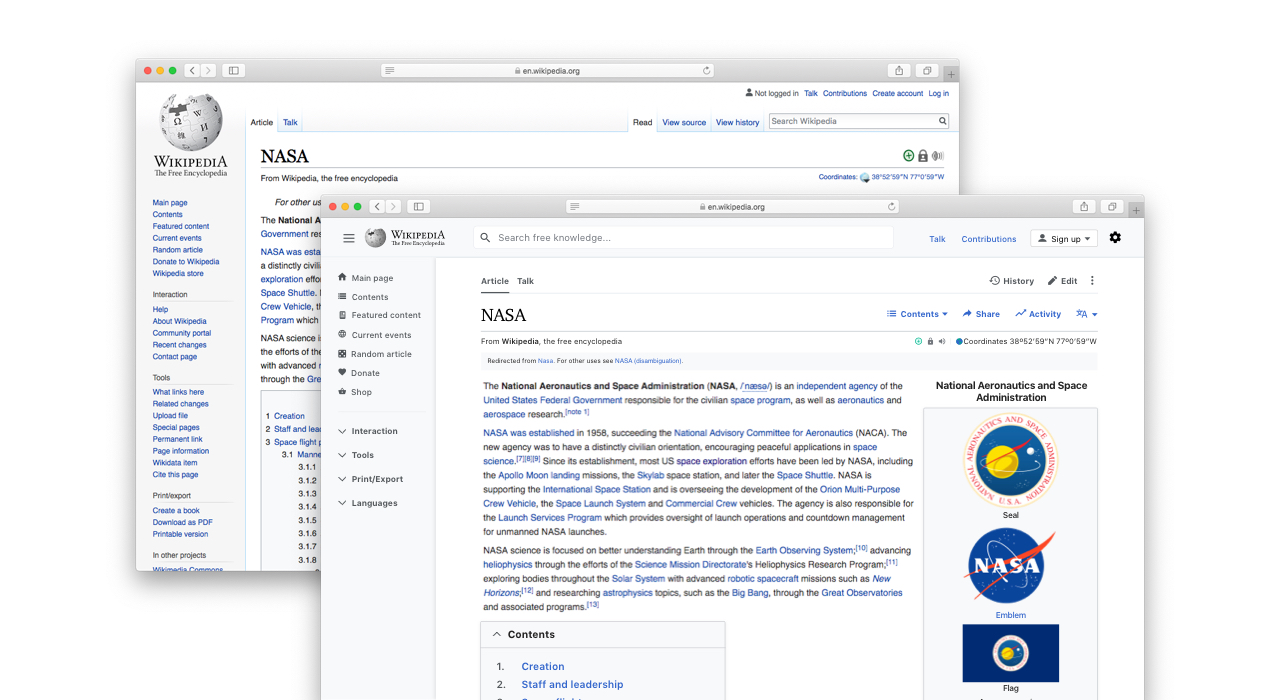
Alex: Ultimately, we were focused on delivering the best reading and editing experience we could, somewhat regardless of familiarity for experienced users. For example, moving the table of contents from being inline below the lead section to being a sidebar, from a familiarity perspective, was a huge shift, and a lot of experienced users couldn’t get past that. For them, it violated the platonic form of a Wikipedia article or something, like if the table of contents wasn’t inline, then the article wasn’t a Wikipedia article. And while they tried to justify that preference from a functionality standpoint, their reasons weren’t strong, and I think it was mostly about them being uncomfortable with the unfamiliar. Meanwhile, all of the testing and the functional justifications we, and some community members, put forth made it super clear that the sidebar was the better approach. So, that’s how we made that particular decision.
Jon: The table of contents going from within the article to outside the article also uncovered a lot of interesting innovations our community had made for certain articles. For example, in some articles, they’d converted the standard table of contents to a horizontal layout using some inline styles or only listed the top-level headings using display: none in CSS to hide the rest. These customizations were broken when we implemented our redesign, which has opened up interesting discussions about whether customizations should be core parts of the software and how they should work in the new design.
Alex: I think the question of familiarity came into play more in terms of the rollout and how much we could change at once. We were sensitive to the risk of upsetting this very small part of the community that has an outsized influence on our decisions. Our fear was they would try to shut the project down, which has happened with other projects, big and small, in the past. So, for example, we didn’t include an increased font size in the first version of the new interface, even though we (and many community members) strongly believed it would be a significant improvement. We know from past projects that typography is a particularly hot-button topic.
Geoff: Who else was involved in the redesign? What roles did they play, and how did you manage all the work?
Alex: As far as our team goes, it’s about 5-6 Engineers, a Product Manager, a Community Specialist, and someone on Quality Assurance. Pretty much everyone was involved in a meaningful way in terms of exploring design challenges and weighing in on various options. Olga, the Product Manager, and several of the Engineers are better than I am when it comes to thinking about certain challenges. One clear example is accessibility.
There were several community members who were close collaborators and hundreds of others who were more casually involved. The majority of that collaboration happens on Phabricator, which is our task-tracking system. Of course, the timing gets tricky because community members might jump in with ideas or concerns as we’re finishing up a feature, maybe just because they weren’t aware that the conversation had started a few months back or whatever.
And then there’s the Wikimedia Foundation (WMF) design team. Each member of the design team has their own product team they belong to, so involvement, for the most part, happens via design reviews. There was a bunch of overlap, particularly between the work we were doing and the stuff the editing team worked on, so I got to collaborate closely with that designer. Also, each designer is assigned a design mentor. So, Rita, who is my design mentor — and who also happens to be an incredible designer and person — was behind the scenes all along, helping me figure everything out.
To me, the whole process felt pretty inclusive. A lot of the time, it felt like the process and the conversations were guiding things more than any one individual, which is both cool and a little scary.
Geoff: Wikipedia has been used to study online text legibility (PDF) because of its heavy focus on content. Yet, there have been so many advances in web fonts and typography since the last significant Wikipedia redesign in 2004, from variable font formats and fluid typography to even newer stuff in CSS from this past year, like the super new text-wrap: balance and a new line height (lh) unit. What design considerations went into the text in the latest redesign?
Alex: As far as I understand, there was a typography refresh back in 2014, which succeeded in some ways but was also super contentious. In terms of design ownership, there’s an unwritten understanding that the volunteer community owns the content, and WMF owns the interface. And while the typography is clearly a fundamental part of the overall user experience of the site, it’s definitely on the content side of the content-interface divide, which makes it more difficult for us to work on.
Prior to this project, a lot of great work had already been done by the Design Systems Team regarding the font stack (which is critical, given all of the different language editions of Wikipedia), how the type sizing is declared (which has a big impact on the experience if you manually change the font size), and other things like that.
For this project, from a sort of 80/20 perspective, I think 80% of the room for improvement was managing the line length by adding a max-width, and increasing the base font-size value (which is hopefully coming soon). We did spend a bunch of time looking into other refinements that are forthcoming.
Jon: I actually worked on that typography refresh early in my career at the Wikimedia Foundation. It was contentious for two reasons. First, we added a limited container width for the content and used Helvetica Neue for the font. The latter was a problem due to the “open source” nature of the project, which the community felt strongly about. We compromised by preferring an open font when available, which I think was Linux Libertine at the time.
That project was a lot shorter in terms of time, and we had more important problems to solve, such as having a functioning mobile site and a WYSIWYG editor. So, no compromise could be found on the limited width front. But I was glad we finally got that in with this redesign, even if it came eight years later. Free knowledge is more a marathon than a sprint.
Alex: I do think it’s ironic that Wikipedia, one of the most popular text-based websites on the internet, doesn’t necessarily have a super strong typography practice, at least from a design perspective. Maybe a lot of that has to do with how varied the content is, how many different templates we have, and all of the different languages we need to support. Maybe it would have to almost be a language-by-language endeavor if we were ever to pull it off. I’m not sure.
Editor’s Note: The main discussion and prototype for the project’s typography efforts are available to view.
Geoff: Speaking of the differences in web design since 2004, the term “responsive web design” was also coined in that span of time. Wikipedia has no doubt had a mobile presence for some time, but were there any new challenges to make the site more responsive, given how best practices have evolved?
Alex: We set a soft goal of delivering a great experience down to a 500px browser width. I think it’s fairly uncommon for people to be using desktop or laptop devices with browsers that narrow. But these days, it’s pretty easy to achieve a fully-responsive site with CSS alone, so there didn’t seem to be much of a tradeoff there. Plus, we heard from a few editors that they often tile two or three browser windows side-by-side, so it can get narrow in those cases. The updated interface does feature three menus that can be pinned open as sidebars or collapsed as dropdowns, which is a configuration mainly for logged-in users in order to give them more control over their workstations. And the state of those menus is managed by JavaScript, which presented a slight challenge. Jon wrote a great article a few years ago about why we still have separate mobile and desktop sites.
I think another aspect of making things work well down to 500px was that we wanted to push ourselves to see how close we might be able to get to have one site for all devices, though we’re not quite there yet.
Jon: If I remember correctly, Alex and I had a good back-and-forth about that 500px threshold. In theory, we could have supported a breakpoint below that, and Alex had the mockups ready, but I was concerned that it would slow down development. Plus, the use case was not there as most of our users were resizing browsers, and we could back that up with data.
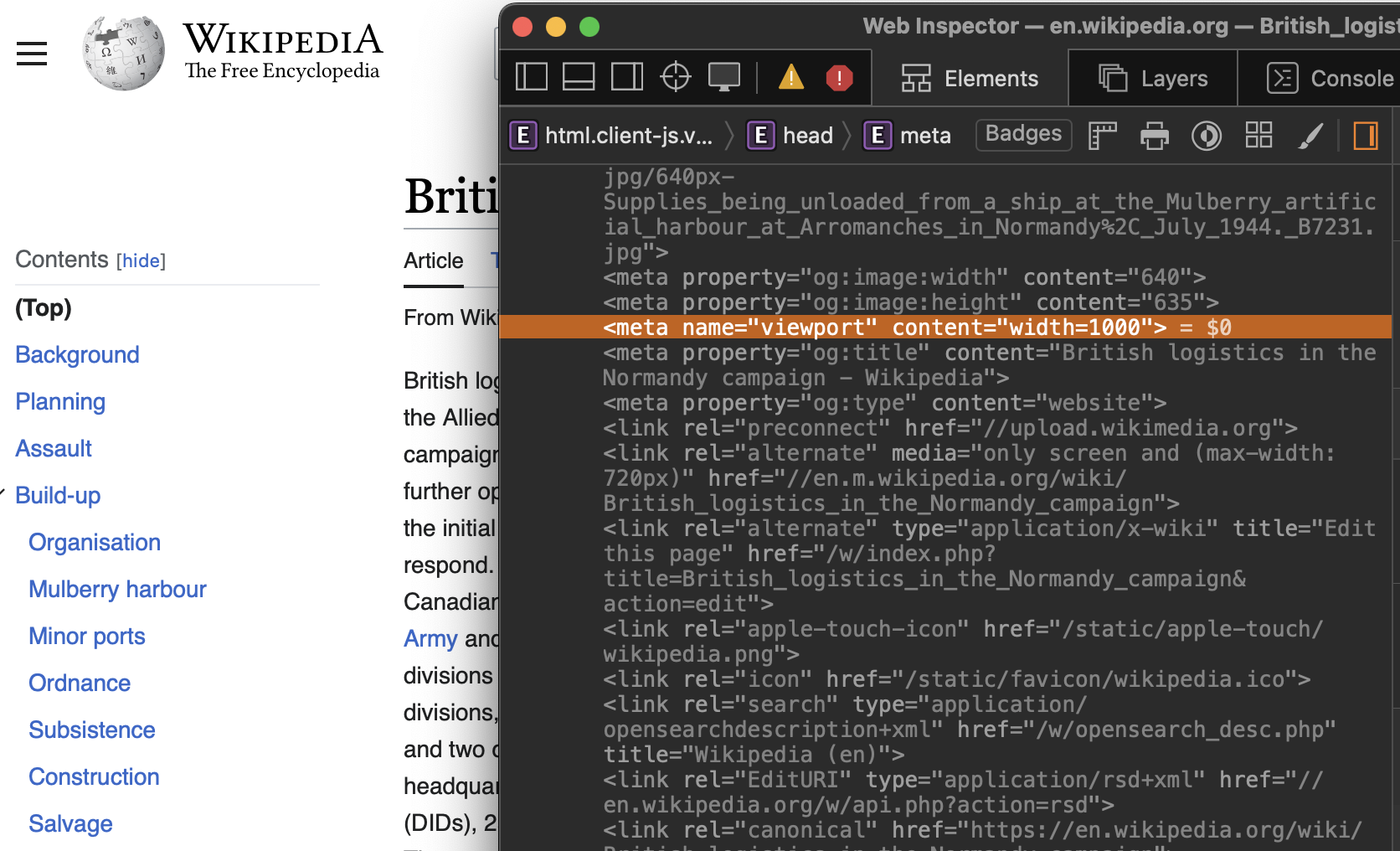
In fact, during the redesign, vocal members of our community pushed us to introduce an explicit viewport size in our markup because they were annoyed that the table of contents component was collapsing inconsistently in browsers. If you view the source, you’ll now see <meta name="viewport" content="width=1000">.
Note: You can even read the entire discussion about the change.
Geoff: I know front-end nerds will want to know how CSS is written and managed in this latest design because, well, I’m one of them! What does the process look like to make an edit to the styles?
Jon: You have to remember that Wikipedia — and the MediaWiki software that provides it — is quite old and very large, and some of our technology stack reflects that.
MediaWiki is primarily a progressively enhanced web page written in PHP, so we tend to ship HTML with vanilla JavaScript and CSS that enhances it. Our front end is really unusual in that we have no build scripts for our JavaScript and CSS. We write ES6 code without transpiling it, and we use LESS compiled at runtime in PHP, with heavy caching, for our CSS. HTML is provided by Mustache templates.
We are very conservative about what libraries and technologies we use, particularly if they are likely to have an impact on others in the stack. We use TypeScript in the project to validate our code using JSDoc blocks but do not write our code in TypeScript as many of our volunteers do not know the language, and we don’t want to alienate them.
There was talk about replacing LESS with a different CSS preprocessor, but we decided to retain the status quo we’ve used since 2013 because we don’t want to fragment our codebase. We currently use Mustache templates because that’s what we’ve used since 2014, but we hope to eventually phase those out and replace them with Vue.js templates.
All our code is open-sourced, which is pretty unusual and cool! So, if you ever see some visual thing that looks off or could be improved, we’re always happy to take PRs with CSS that fix it.
Geoff: Another nerdy but key question for you: how important were performance considerations to the redesign? What specific things do you look for in Wikipedia’s performance, and what tools do you use to measure them?
Jon: Performance is really important to us, as Wikipedia is global, and we have many projects growing in areas with slower internet connections. We have a performance dashboard that we monitor where we collect global data from our users using the NavigationTiming API. And we run automated synthetic performance tests using Sitespeed.io. This is all public, and anyone can dig into the data!
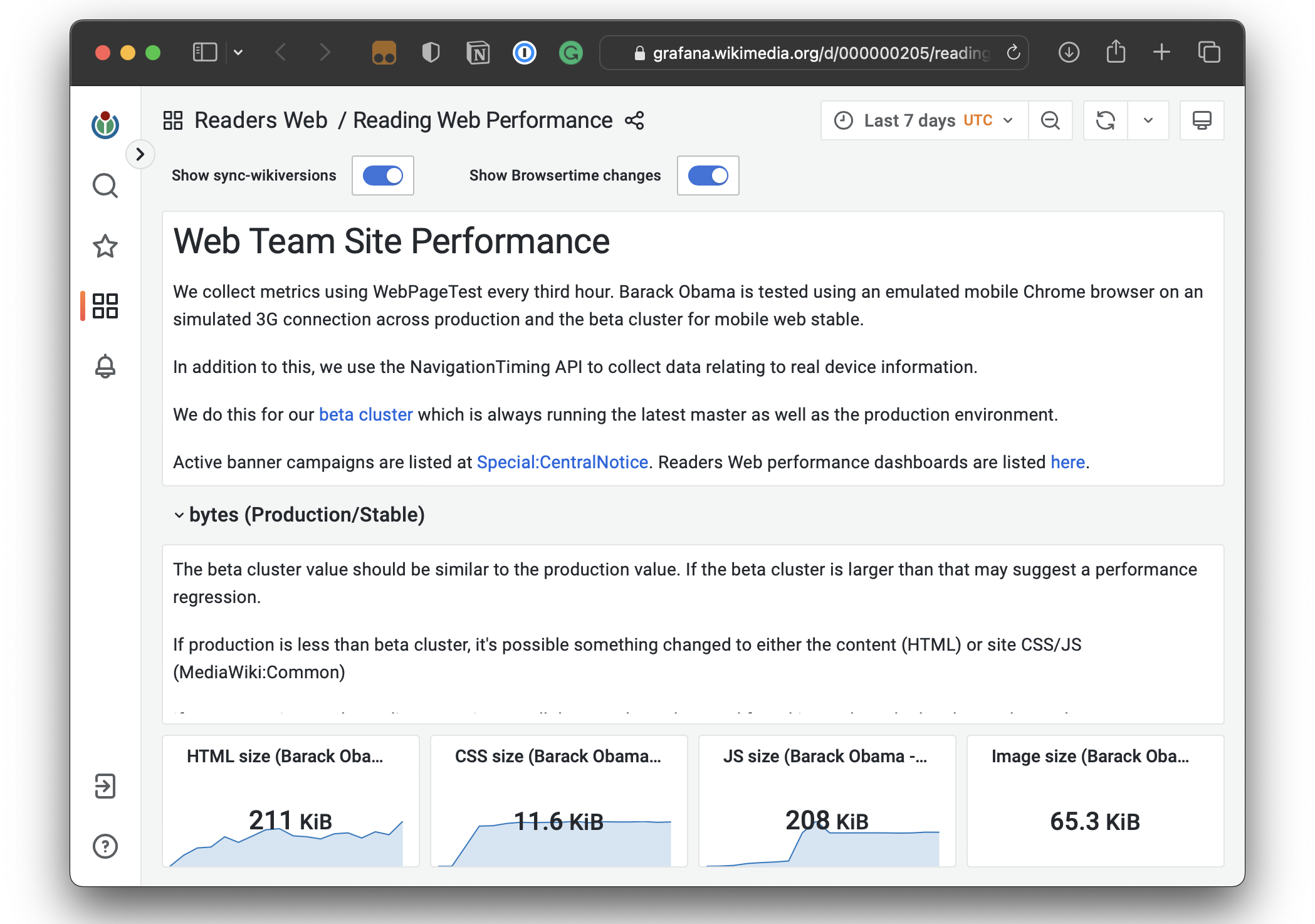
One of the biggest concerns for this redesign project was how replacing the internal search feature might lose users if it became too slow or unresponsive. We added instrumentation specifically designed to monitor this, and there’s a detailed write-up on how we analyzed the findings with synthetic performance tests.
Besides thinking about performance for specific features, we monitor bundle sizes of our render-blocking CSS assets, and our CI pipeline blocks anything that goes over our performance budget. We also run spikes to see if there are additional ways to improve performance. For example, in a quiet period, we ran a spike, which made our mobile site 300ms faster.
Given that we have hundreds of volunteers and staff collaborating on the codebase,
It’s a challenge to uphold our own high-performance standards. We’re currently working on implementing a performance budget across all our projects to formally enforce this and share the knowledge more widely for everyone to reference.
Geoff: Alex, you’ve noted that one of the goals you defined for the project was to “develop a more flexible interface with an eye towards future features.” What makes the new interface more flexible compared to how it was before, and what future features are you anticipating?
Alex: A small example of a new feature is the sticky header, which is currently only available when you are logged into the site. We built it knowing that for different types of pages, like article pages versus discussion pages versus help pages, et cetera, we would want to put different types of tools in the sticky header. That forethought can save a lot of time and complexity in terms of development.
Another aspect of flexibility, or maybe more specifically, extensibility, is information architecture. The previous interface had two different places for page tools: in the sidebar menu on the left and then above the article title. So, whenever we worked on a new page tools feature, we had to decide where it would go. Creating a clearer and more structured information architecture for the site means there’s one place for page tools, one for global navigation, and so on. I think this will make it easier for us to design new features in the future.
In terms of future features, we’re thinking about reading settings: dark mode, the ability to increase and decrease the font size and line height more easily, and maybe even themes like the Wikipedia apps have. We’re also thinking about ways to help people discover more knowledge related to what they are reading. Other things we might consider are reading features, like the ability to take notes and create collections of articles.
Geoff: Thanks so much to you both for spending some time to share your work with us! Is there anything especially interesting about the design or the work it took to make it that might not be immediately obvious but that you are proud of?
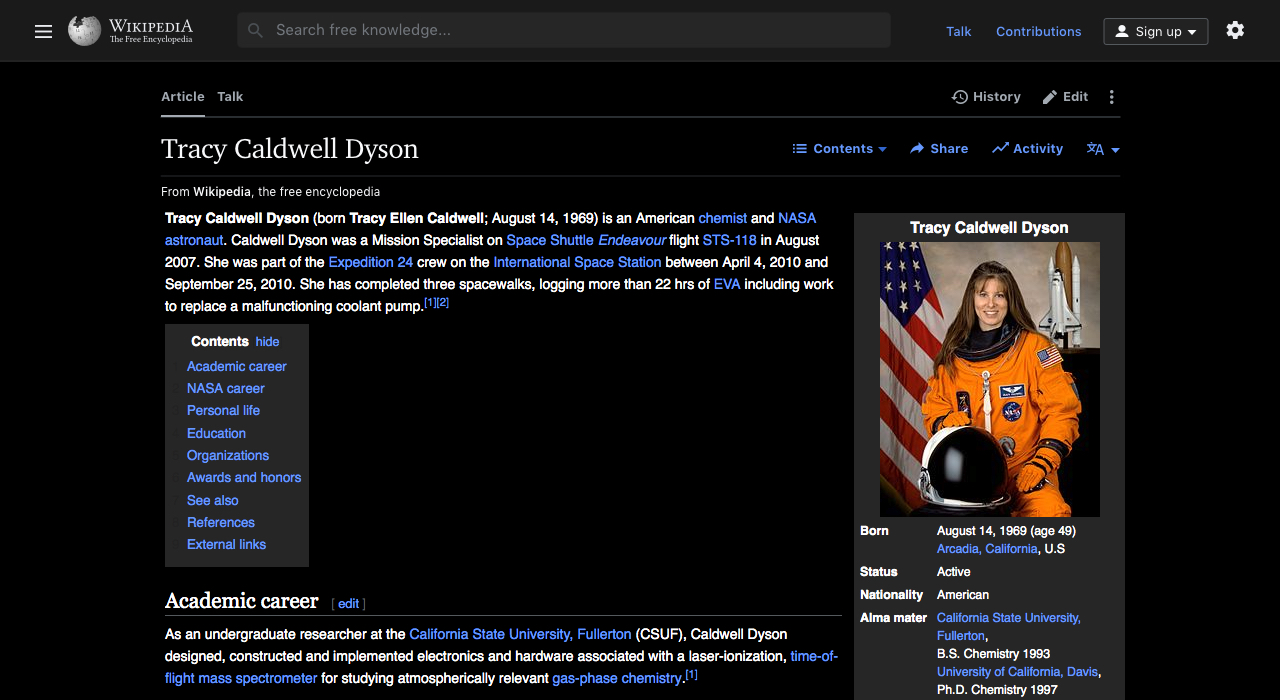
Alex: I think it’s cool to think about super small things that have a big impact. Links are a critical part of the reading experience, and following from that, knowing which links you’ve already visited is important. Previously, there was so little contrast between visited links and black text that this whole sort of navigational wayfinding benefit was missing from experience. Changing the color of visited links was about as simple as a change can be from a technical perspective, with an outsized impact on the user experience.
Another thing I’m interested in and excited about is prototyping, specifically how additional fidelity in prototypes affects the design process. I reached a point where I was predominantly making prototypes with HTML, CSS, and JavaScript to work through design challenges rather than relying on mockups. It’s maybe impossible to know what impact that had in terms of the ability for us to have discussions about the designs, evaluate them, and include community members across many languages, among other things. There’s no way for us to know how the project would have turned out or how much longer it would have taken us to arrive at certain decisions if I hadn’t taken that approach, but my inclination is that it was super helpful.
Jon: The thing I’m most excited about is that the redesign project gave us the time to really pull apart a system that was 21 years old and build the foundation for something more sustainable. Fundamental things like introducing design tokens across the entire software stack are going to be powerful tools that we can use to support user customizations that allow people to change font size and enable a dark mode, the latter of which has been a popular request. So hopefully, we can finally deliver that.