“Any comment?” is probably one of the worst ways to ask for feedback. It’s vague and open ended, and it doesn’t provide any indication of what we’re looking for. Getting good feedback starts earlier than we might expect: it starts with the request.
It might seem counterintuitive to start the process of receiving feedback with a question, but that makes sense if we realize that getting feedback can be thought of as a form of design research. In the same way that we wouldn’t do any research without the right questions to get the insights that we need, the best way to ask for feedback is also to craft sharp questions.
Design critique is not a one-shot process. Sure, any good feedback workflow continues until the project is finished, but this is particularly true for design because design work continues iteration after iteration, from a high level to the finest details. Each level needs its own set of questions.
And finally, as with any good research, we need to review what we got back, get to the core of its insights, and take action. Question, iteration, and review. Let’s look at each of those.
The question#section2
Being open to feedback is essential, but we need to be precise about what we’re looking for. Just saying “Any comment?”, “What do you think?”, or “I’d love to get your opinion” at the end of a presentation—whether it’s in person, over video, or through a written post—is likely to get a number of varied opinions or, even worse, get everyone to follow the direction of the first person who speaks up. And then… we get frustrated because vague questions like those can turn a high-level flows review into people instead commenting on the borders of buttons. Which might be a hearty topic, so it might be hard at that point to redirect the team to the subject that you had wanted to focus on.
But how do we get into this situation? It’s a mix of factors. One is that we don’t usually consider asking as a part of the feedback process. Another is how natural it is to just leave the question implied, expecting the others to be on the same page. Another is that in nonprofessional discussions, there’s often no need to be that precise. In short, we tend to underestimate the importance of the questions, so we don’t work on improving them.
The act of asking good questions guides and focuses the critique. It’s also a form of consent: it makes it clear that you’re open to comments and what kind of comments you’d like to get. It puts people in the right mental state, especially in situations when they weren’t expecting to give feedback.
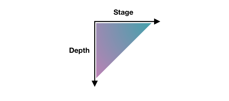
There isn’t a single best way to ask for feedback. It just needs to be specific, and specificity can take many shapes. A model for design critique that I’ve found particularly useful in my coaching is the one of stage versus depth.

“Stage” refers to each of the steps of the process—in our case, the design process. In progressing from user research to the final design, the kind of feedback evolves. But within a single step, one might still review whether some assumptions are correct and whether there’s been a proper translation of the amassed feedback into updated designs as the project has evolved. A starting point for potential questions could derive from the layers of user experience. What do you want to know: Project objectives? User needs? Functionality? Content? Interaction design? Information architecture? UI design? Navigation design? Visual design? Branding?
Here’re a few example questions that are precise and to the point that refer to different layers:
- Functionality: Is automating account creation desirable?
- Interaction design: Take a look through the updated flow and let me know whether you see any steps or error states that I might’ve missed.
- Information architecture: We have two competing bits of information on this page. Is the structure effective in communicating them both?
- UI design: What are your thoughts on the error counter at the top of the page that makes sure that you see the next error, even if the error is out of the viewport?
- Navigation design: From research, we identified these second-level navigation items, but once you’re on the page, the list feels too long and hard to navigate. Are there any suggestions to address this?
- Visual design: Are the sticky notifications in the bottom-right corner visible enough?
The other axis of specificity is about how deep you’d like to go on what’s being presented. For example, we might have introduced a new end-to-end flow, but there was a specific view that you found particularly challenging and you’d like a detailed review of that. This can be especially useful from one iteration to the next where it’s important to highlight the parts that have changed.
There are other things that we can consider when we want to achieve more specific—and more effective—questions.
A simple trick is to remove generic qualifiers from your questions like “good,” “well,” “nice,” “bad,” “okay,” and “cool.” For example, asking, “When the block opens and the buttons appear, is this interaction good?” might look specific, but you can spot the “good” qualifier, and convert it to an even better question: “When the block opens and the buttons appear, is it clear what the next action is?”
Sometimes we actually do want broad feedback. That’s rare, but it can happen. In that sense, you might still make it explicit that you’re looking for a wide range of opinions, whether at a high level or with details. Or maybe just say, “At first glance, what do you think?” so that it’s clear that what you’re asking is open ended but focused on someone’s impression after their first five seconds of looking at it.
Sometimes the project is particularly expansive, and some areas may have already been explored in detail. In these situations, it might be useful to explicitly say that some parts are already locked in and aren’t open to feedback. It’s not something that I’d recommend in general, but I’ve found it useful to avoid falling again into rabbit holes of the sort that might lead to further refinement but aren’t what’s most important right now.
Asking specific questions can completely change the quality of the feedback that you receive. People with less refined critique skills will now be able to offer more actionable feedback, and even expert designers will welcome the clarity and efficiency that comes from focusing only on what’s needed. It can save a lot of time and frustration.
The iteration#section3
Design iterations are probably the most visible part of the design work, and they provide a natural checkpoint for feedback. Yet a lot of design tools with inline commenting tend to show changes as a single fluid stream in the same file, and those types of design tools make conversations disappear once they’re resolved, update shared UI components automatically, and compel designs to always show the latest version—unless these would-be helpful features were to be manually turned off. The implied goal that these design tools seem to have is to arrive at just one final copy with all discussions closed, probably because they inherited patterns from how written documents are collaboratively edited. That’s probably not the best way to approach design critiques, but even if I don’t want to be too prescriptive here: that could work for some teams.
The asynchronous design-critique approach that I find most effective is to create explicit checkpoints for discussion. I’m going to use the term iteration post for this. It refers to a write-up or presentation of the design iteration followed by a discussion thread of some kind. Any platform that can accommodate this structure can use this. By the way, when I refer to a “write-up or presentation,” I’m including video recordings or other media too: as long as it’s asynchronous, it works.
Using iteration posts has many advantages:
- It creates a rhythm in the design work so that the designer can review feedback from each iteration and prepare for the next.
- It makes decisions visible for future review, and conversations are likewise always available.
- It creates a record of how the design changed over time.
- Depending on the tool, it might also make it easier to collect feedback and act on it.
These posts of course don’t mean that no other feedback approach should be used, just that iteration posts could be the primary rhythm for a remote design team to use. And other feedback approaches (such as live critique, pair designing, or inline comments) can build from there.
I don’t think there’s a standard format for iteration posts. But there are a few high-level elements that make sense to include as a baseline:
- The goal
- The design
- The list of changes
- The questions
Each project is likely to have a goal, and hopefully it’s something that’s already been summarized in a single sentence somewhere else, such as the client brief, the product manager’s outline, or the project owner’s request. So this is something that I’d repeat in every iteration post—literally copy and pasting it. The idea is to provide context and to repeat what’s essential to make each iteration post complete so that there’s no need to find information spread across multiple posts. If I want to know about the latest design, the latest iteration post will have all that I need.
This copy-and-paste part introduces another relevant concept: alignment comes from repetition. So having posts that repeat information is actually very effective toward making sure that everyone is on the same page.
The design is then the actual series of information-architecture outlines, diagrams, flows, maps, wireframes, screens, visuals, and any other kind of design work that’s been done. In short, it’s any design artifact. For the final stages of work, I prefer the term blueprint to emphasize that I’ll be showing full flows instead of individual screens to make it easier to understand the bigger picture.
It can also be useful to label the artifacts with clear titles because that can make it easier to refer to them. Write the post in a way that helps people understand the work. It’s not too different from organizing a good live presentation.
For an efficient discussion, you should also include a bullet list of the changes from the previous iteration to let people focus on what’s new, which can be especially useful for larger pieces of work where keeping track, iteration after iteration, could become a challenge.
And finally, as noted earlier, it’s essential that you include a list of the questions to drive the design critique in the direction you want. Doing this as a numbered list can also help make it easier to refer to each question by its number.
Not all iterations are the same. Earlier iterations don’t need to be as tightly focused—they can be more exploratory and experimental, maybe even breaking some of the design-language guidelines to see what’s possible. Then later, the iterations start settling on a solution and refining it until the design process reaches its end and the feature ships.
I want to highlight that even if these iteration posts are written and conceived as checkpoints, by no means do they need to be exhaustive. A post might be a draft—just a concept to get a conversation going—or it could be a cumulative list of each feature that was added over the course of each iteration until the full picture is done.
Over time, I also started using specific labels for incremental iterations: i1, i2, i3, and so on. This might look like a minor labelling tip, but it can help in multiple ways:
- Unique—It’s a clear unique marker. Within each project, one can easily say, “This was discussed in i4,” and everyone knows where they can go to review things.
- Unassuming—It works like versions (such as v1, v2, and v3) but in contrast, versions create the impression of something that’s big, exhaustive, and complete. Iterations must be able to be exploratory, incomplete, partial.
- Future proof—It resolves the “final” naming problem that you can run into with versions. No more files named “final final complete no-really-its-done.” Within each project, the largest number always represents the latest iteration.
To mark when a design is complete enough to be worked on, even if there might be some bits still in need of attention and in turn more iterations needed, the wording release candidate (RC) could be used to describe it: “with i8, we reached RC” or “i12 is an RC.”
The review#section4
What usually happens during a design critique is an open discussion, with a back and forth between people that can be very productive. This approach is particularly effective during live, synchronous feedback. But when we work asynchronously, it’s more effective to use a different approach: we can shift to a user-research mindset. Written feedback from teammates, stakeholders, or others can be treated as if it were the result of user interviews and surveys, and we can analyze it accordingly.
This shift has some major benefits that make asynchronous feedback particularly effective, especially around these friction points:
- It removes the pressure to reply to everyone.
- It reduces the frustration from swoop-by comments.
- It lessens our personal stake.
The first friction point is feeling a pressure to reply to every single comment. Sometimes we write the iteration post, and we get replies from our team. It’s just a few of them, it’s easy, and it doesn’t feel like a problem. But other times, some solutions might require more in-depth discussions, and the amount of replies can quickly increase, which can create a tension between trying to be a good team player by replying to everyone and doing the next design iteration. This might be especially true if the person who’s replying is a stakeholder or someone directly involved in the project who we feel that we need to listen to. We need to accept that this pressure is absolutely normal, and it’s human nature to try to accommodate people who we care about. Sometimes replying to all comments can be effective, but if we treat a design critique more like user research, we realize that we don’t have to reply to every comment, and in asynchronous spaces, there are alternatives:
- One is to let the next iteration speak for itself. When the design evolves and we post a follow-up iteration, that’s the reply. You might tag all the people who were involved in the previous discussion, but even that’s a choice, not a requirement.
- Another is to briefly reply to acknowledge each comment, such as “Understood. Thank you,” “Good points—I’ll review,” or “Thanks. I’ll include these in the next iteration.” In some cases, this could also be just a single top-level comment along the lines of “Thanks for all the feedback everyone—the next iteration is coming soon!”
- Another is to provide a quick summary of the comments before moving on. Depending on your workflow, this can be particularly useful as it can provide a simplified checklist that you can then use for the next iteration.
The second friction point is the swoop-by comment, which is the kind of feedback that comes from someone outside the project or team who might not be aware of the context, restrictions, decisions, or requirements—or of the previous iterations’ discussions. On their side, there’s something that one can hope that they might learn: they could start to acknowledge that they’re doing this and they could be more conscious in outlining where they’re coming from. Swoop-by comments often trigger the simple thought “We’ve already discussed this…”, and it can be frustrating to have to repeat the same reply over and over.
Let’s begin by acknowledging again that there’s no need to reply to every comment. If, however, replying to a previously litigated point might be useful, a short reply with a link to the previous discussion for extra details is usually enough. Remember, alignment comes from repetition, so it’s okay to repeat things sometimes!
Swoop-by commenting can still be useful for two reasons: they might point out something that still isn’t clear, and they also have the potential to stand in for the point of view of a user who’s seeing the design for the first time. Sure, you’ll still be frustrated, but that might at least help in dealing with it.
The third friction point is the personal stake we could have with the design, which could make us feel defensive if the review were to feel more like a discussion. Treating feedback as user research helps us create a healthy distance between the people giving us feedback and our ego (because yes, even if we don’t want to admit it, it’s there). And ultimately, treating everything in aggregated form allows us to better prioritize our work.
Always remember that while you need to listen to stakeholders, project owners, and specific advice, you don’t have to accept every piece of feedback. You have to analyze it and make a decision that you can justify, but sometimes “no” is the right answer.
As the designer leading the project, you’re in charge of that decision. Ultimately, everyone has their specialty, and as the designer, you’re the one who has the most knowledge and the most context to make the right decision. And by listening to the feedback that you’ve received, you’re making sure that it’s also the best and most balanced decision.
Thanks to Brie Anne Demkiw and Mike Shelton for reviewing the first draft of this article.


